In Place
A new website and brand identity for an end-to-end service for residential moves.

Overview
In Place is an all woman-owned and operated company that helps people move from one home to another by making the move process simple, streamlined, and easy from start to finish.
deliverables
The goal of this client project was to design a new brand identity for a business seeking to expand their customer base and differentiate themselves from competitors. I designed:
A new company Website
New Brand Identity (i.e., logo, color palette, typography, iconography, brand guidelines)
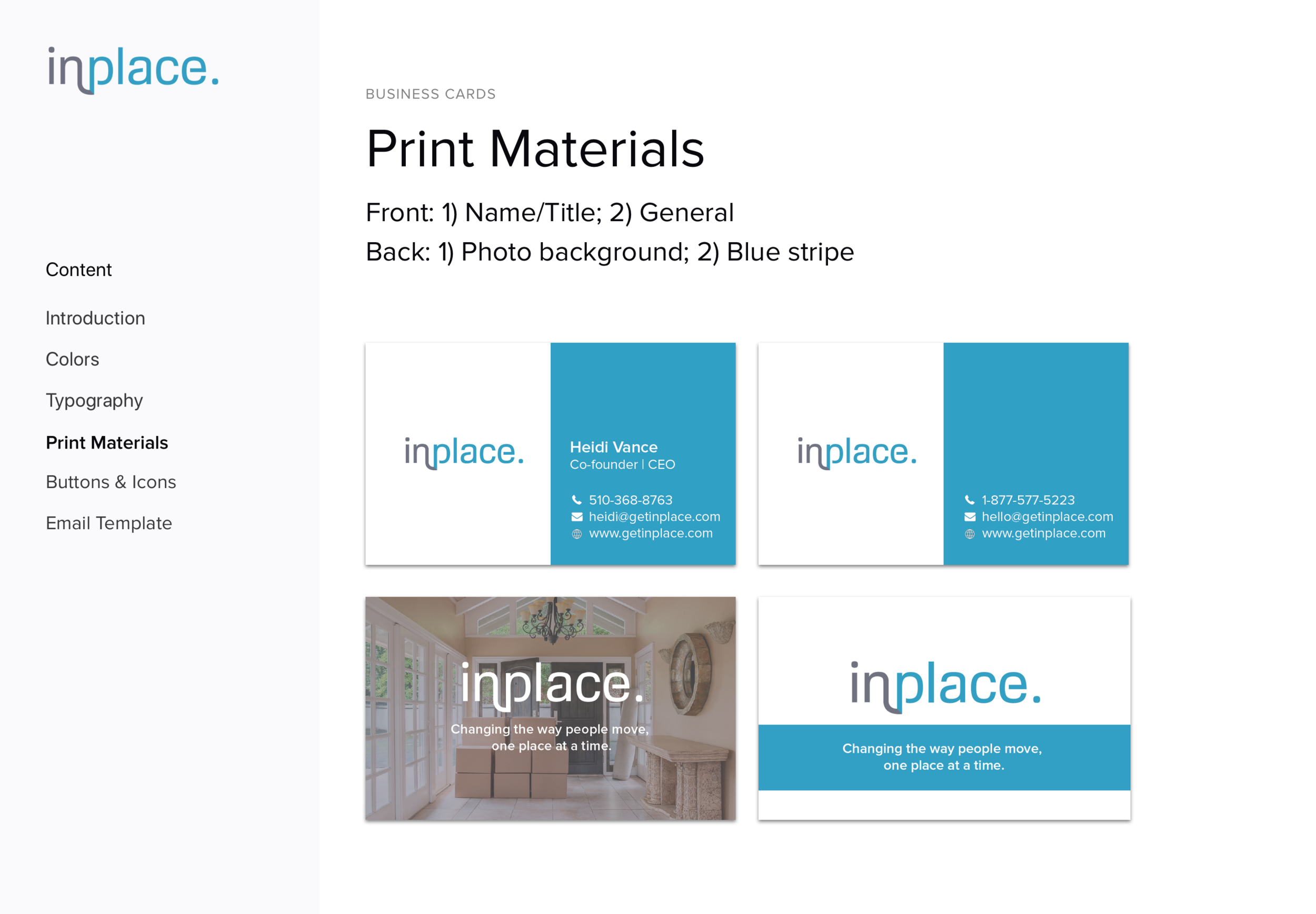
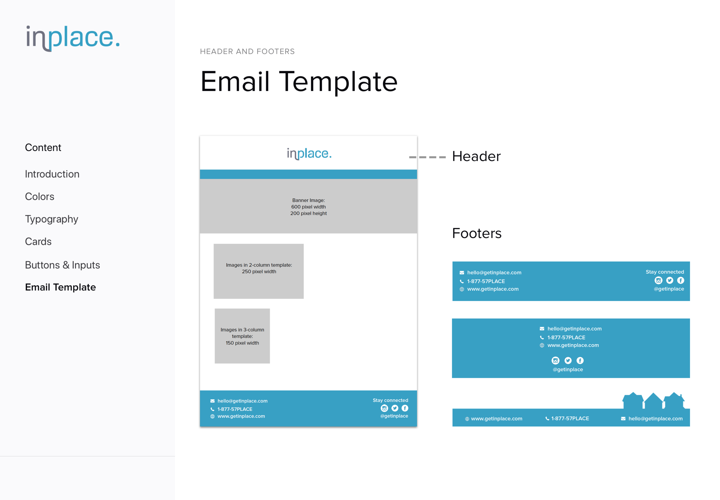
Digital/physical marketing assets (i.e., business cards, email templates, car decals, print collateral)
Role
Lead UX and UI Designer
Skills
Website design, Visual interface design, User research, Usability testing, HTML/CSS coding
Tools
Adobe Illustrator, Sketch, Card Sorting, Microsoft Excel (data analysis)
Timeline
3 months

The Challenge
The process of moving is stressful, anxiety-ridden, and overwhelming for many people. The client’s goal was to make the move process as stress-free and easy as possible, and reflect these qualities in their new brand.
The former company Carefree Moves mainly targeted retired seniors who were downsizing their homes. With the change in ownership, the new owners wanted to rebrand themselves with an updated look and expand their service offerings to appeal to a wider audience.
Final Products
Website | Brand Identity | Digital & Physical Marketing
New Website for In Place
My client needed a new company name, brand identity, and website. I designed, tested, and launched a new brand and fully functional website for In Place to market their business and increase their brand awareness across the Bay Area.
View the final In Place website.

Brand Identity Guidelines
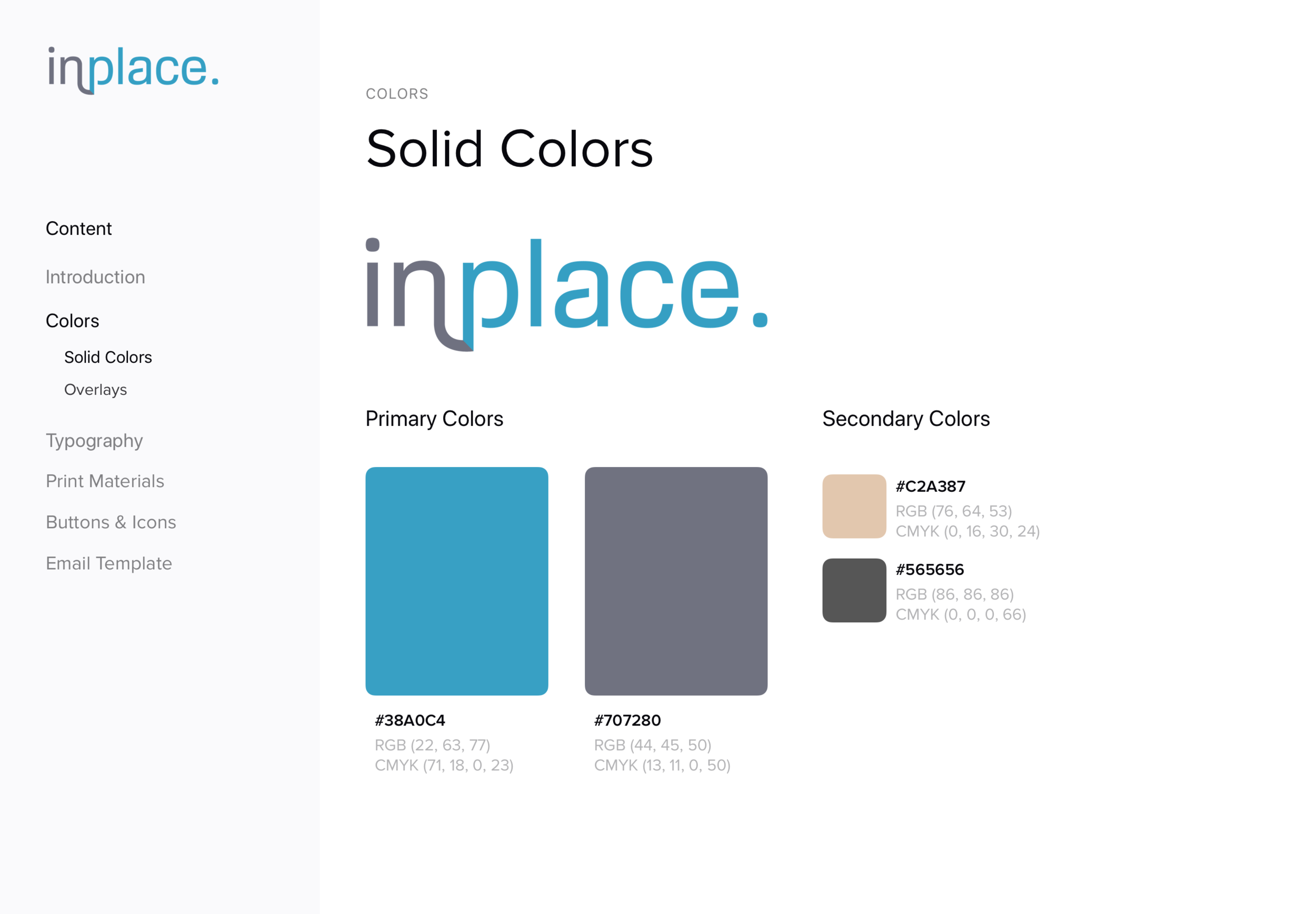
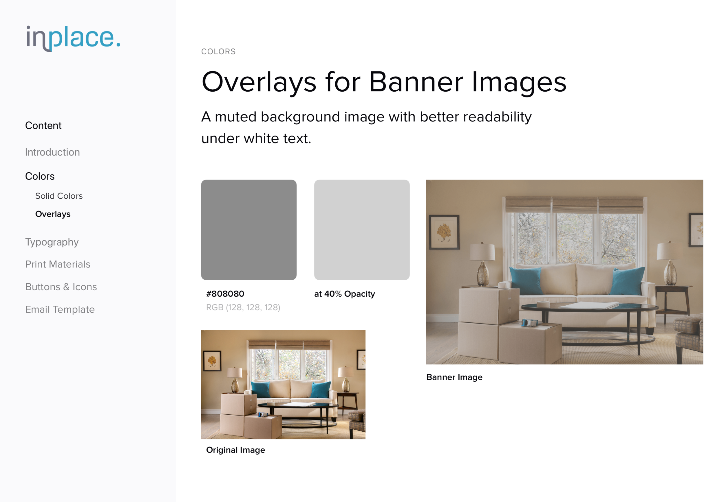
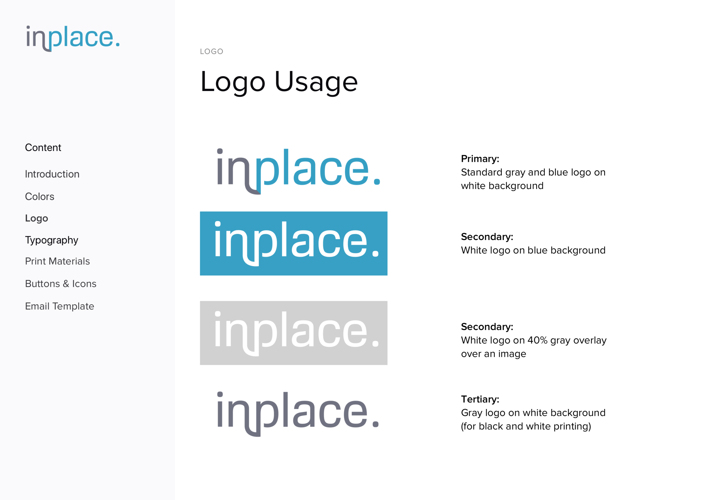
In Place sought to differentiate itself from competitors through a brand identity that was clean, inviting, and refined.
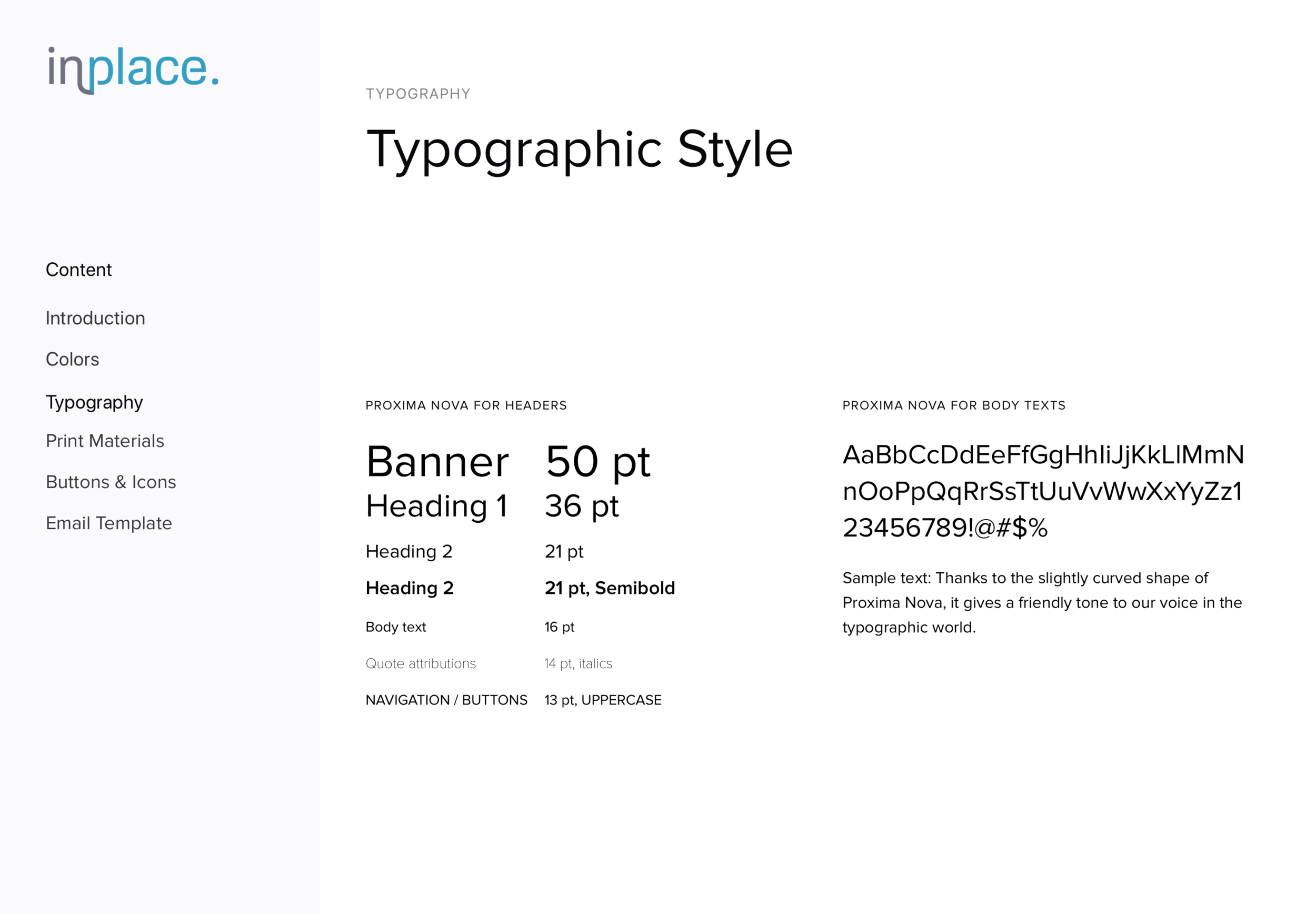
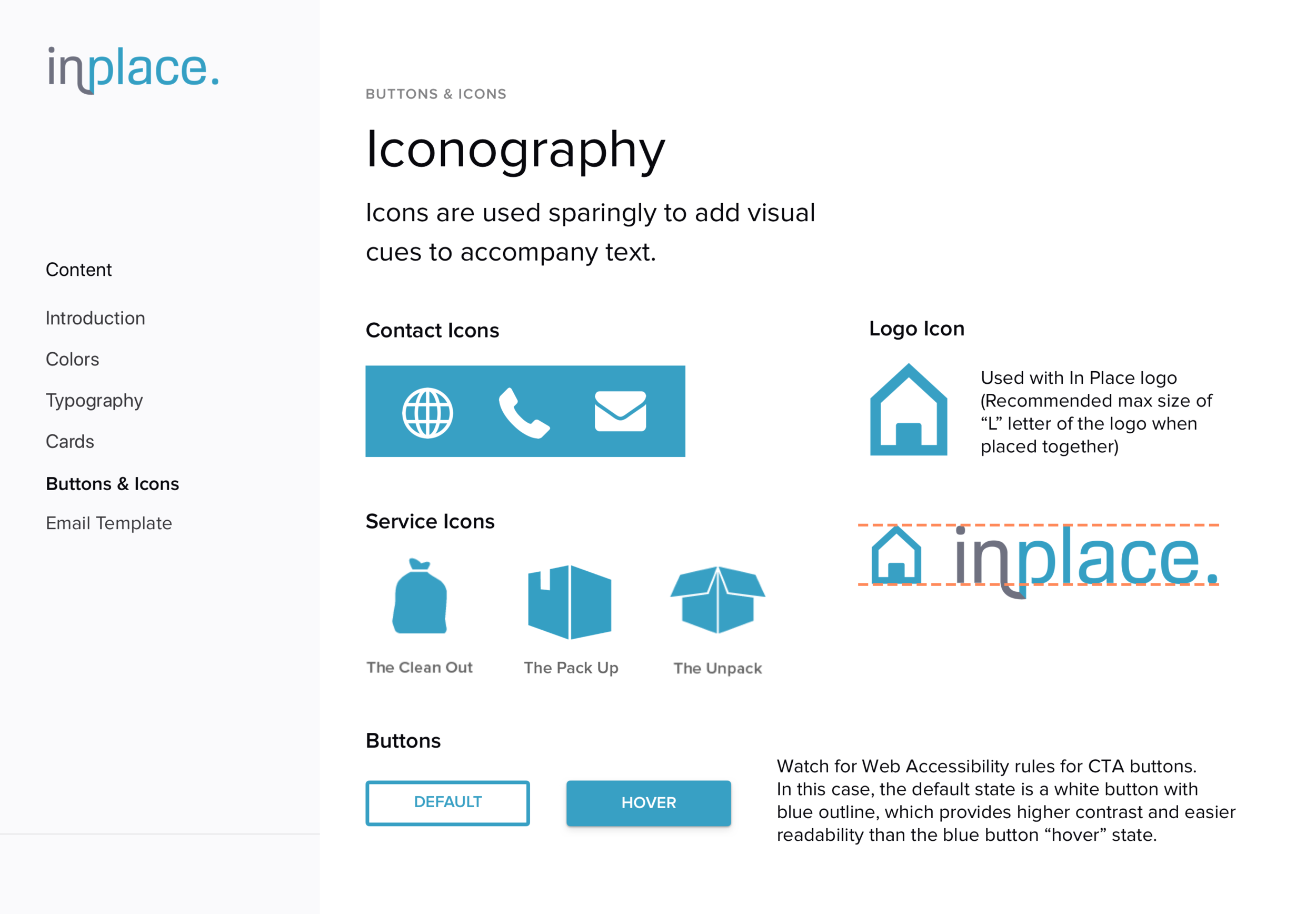
With these attributes in mind, I designed a new logo, color palette, typography and iconography. I then created formal brand guidelines and a cohesive design system that elevated their brand to the next level.
Digital and Physical Marketing Assets
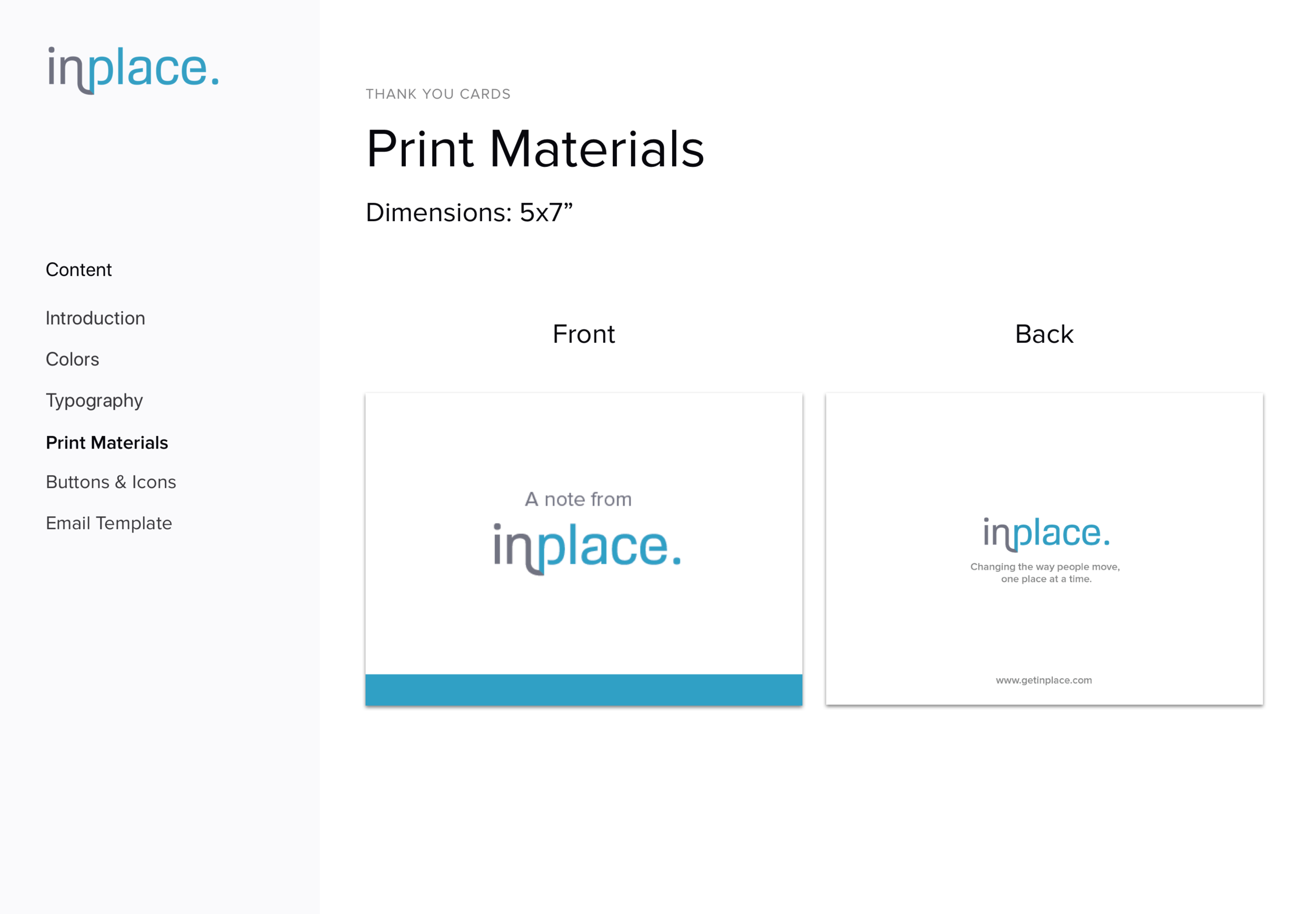
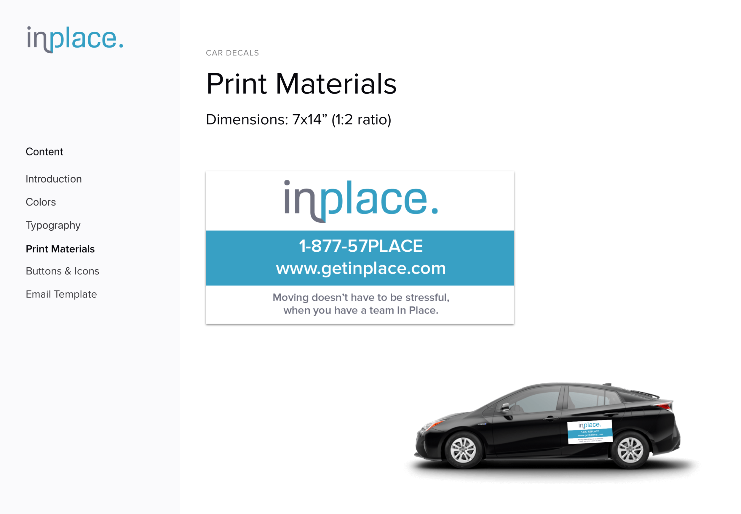
I designed business cards, email templates, car decals, and flyers to complete the brand identity for In Place and enable them to connect with potential customers.

Design Research
Brand Audit | Competitive research | card Sorting & Analysis
Brand audit revealed content organization issues
To begin my research, I conducted a brand audit of the former Carefree Moves website and competitor brands to understand the moving landscape.
The current Carefree Moves site is laid out in a vertical scroll that is lengthy and text-heavy. Some initial user testing revealed that this format was overwhelming and hard to navigate; people didn’t know where to go to find the information they needed.


Competitive research led to a unique branding opportunity
Researching competitors revealed a wide array of brand attributes across moving/organizing companies, ranging from local companies with a whimsical/cartoony brand to large corporate chains with a professional/detached vibe. After mapping competitors along a brand matrix, I discovered an opportunity area to create a new brand that felt inviting, local, and sophisticated.

Understanding customer needs to design a better user experience
To better understand what customers were seeking with their home moves, I recruited and interviewed 15 people who fit the target demographic:
Ages 30 to 70+
Mid- to high-income level
Mixture of apartment renters and homeowners across the Bay Area
Common attributes: They were busy working professionals who didn’t have the time or energy to coordinate moving homes themselves and wanted professional help to ease the process.

Card sorting with users determined the best way to organize content
I then conducted an open card sorting exercise with 6 potential customers to learn how people would interact with the new website,. To do this, I:
Created 35+ content cards containing tasks and information that a customer could find on the website. I pulled content from the old Carefree Moves website and competitor sites.
Asked each participant to categorize the cards in groups that made the most sense to them
Asked the participant to label each group with a category title
Analyzed and clustered common themes


Card Sorting Analysis
To visualize common patterns, I clustered the labels created by participants into a spreadsheet and applied conditional formatting. A few trends emerged that helped me design the website’s information architecture:
Tasks were grouped and labeled in distinct phases: packing/unpacking, moving, organizing, and other.
User testers desired a brief overview of the entire process in a format that was easily digestible (e.g., bullet points, short video, etc.)
Contacting the company should be the top call to action

Concept Iterations
brand Development | Wireframes | Usability Testing | Launch
Brand & Logo Development
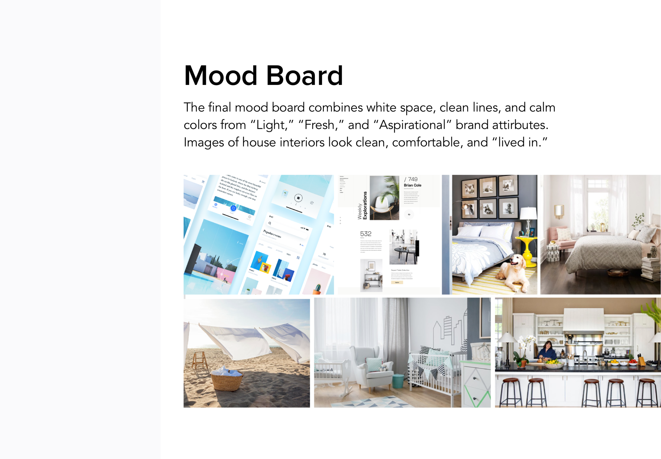
I developed a series of mood boards based on attributes that my clients desired for their brand:
Light/Clean
Friendly
Aspirational
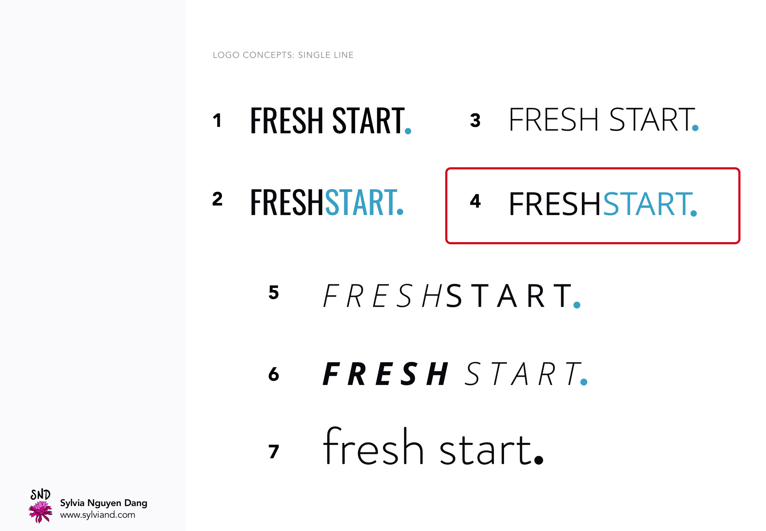
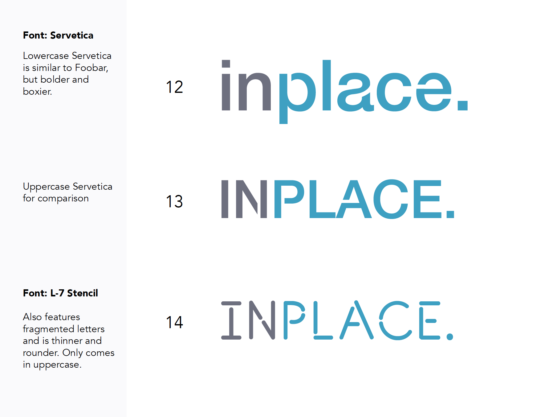
A final color palette of blue, gray, and camel emerged from these boards along with logo explorations. Halfway through logo development, we received mixed user feedback on the name “Fresh Start,” so we tested and finalized “In Place” as the new company name and logo.

Information Architecture
Based on card sorting results, I designed a basic information architecture to prioritize content in a way that made the most sense to users.

Wireframes
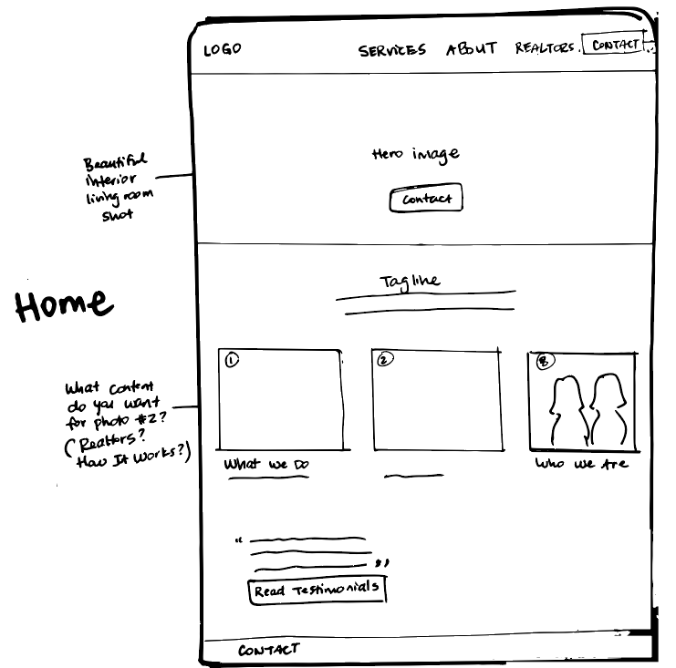
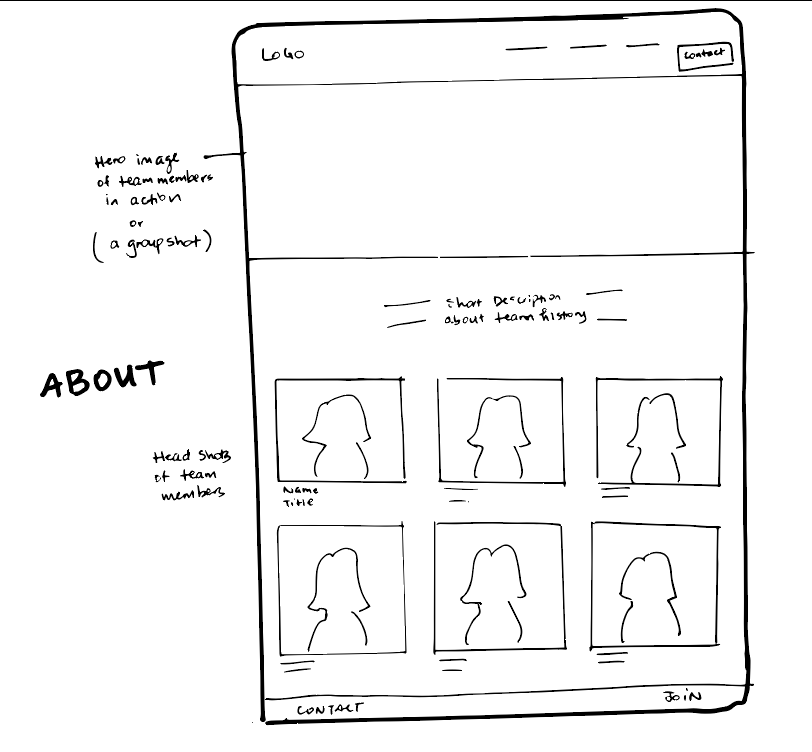
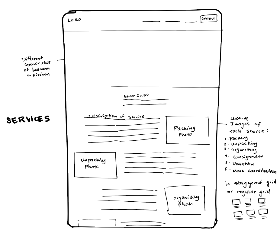
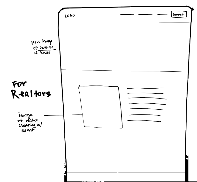
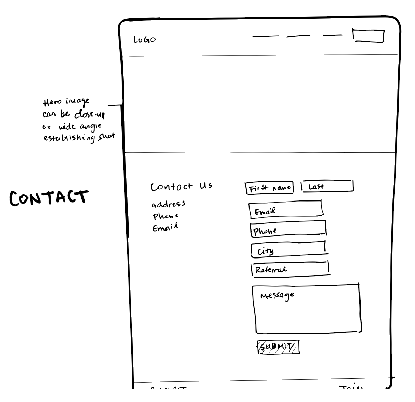
I then created preliminary wireframe sketches of each web page to help the copywriter visualize sections for written content.
Usability Testing
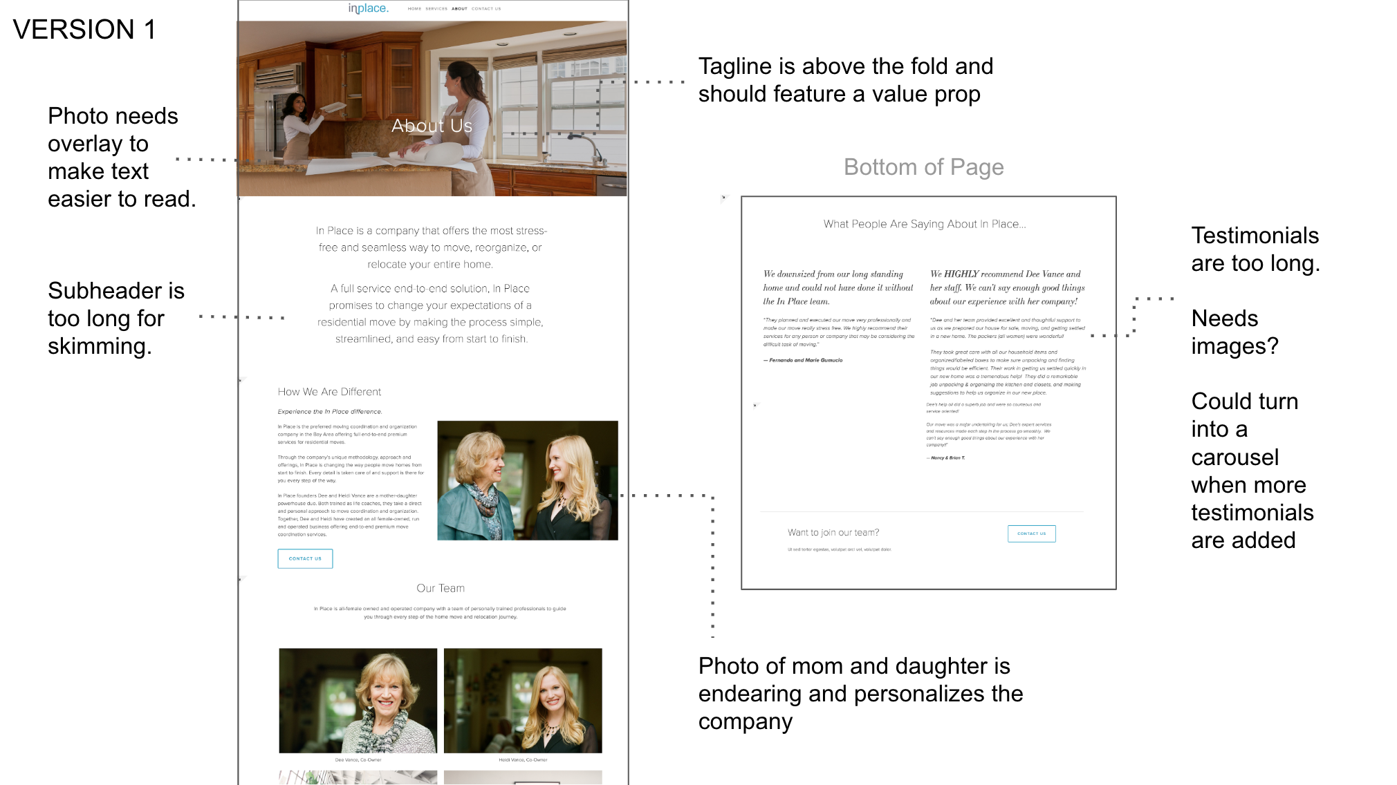
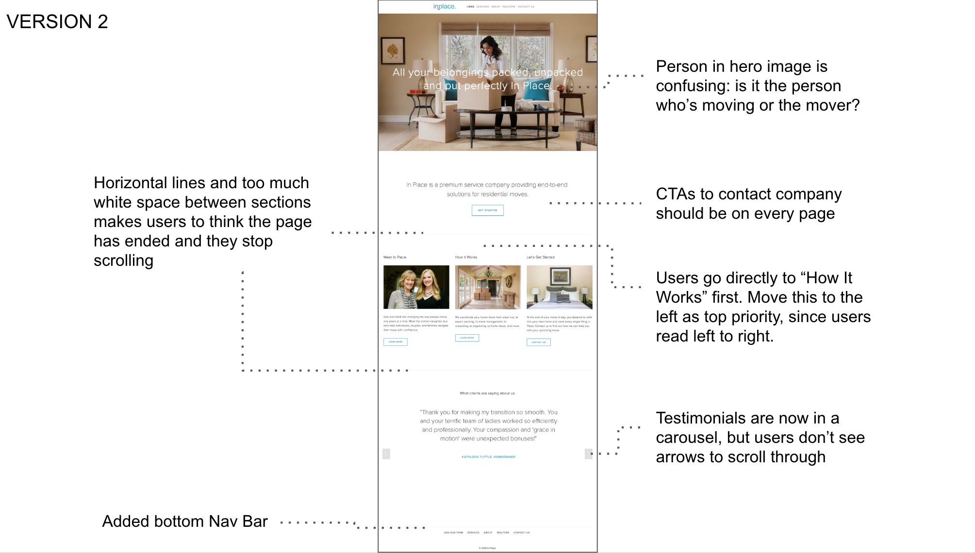
Next, I tested website mockups with another set of potential customers and discovered several insights that improved overall navigation and content structure. I reduced whitespace between sections to encourage scrolling, experimented with taglines, and made calls to action clear and prominent.
Along the way, I encountered roadblocks with Squarespace. We chose this CMS so my client would be able to maintain the site without extensive technical knowledge. However, the template had limitations and I had to work around them by coding additional HTML/CSS to achieve the optimal look and feel.
The final website can be viewed at www.getinplace.com.
Impact
Positive customer & client feedback
The In Place website and new brand launched mid-February 2019 and is receiving a positive response. My client is very happy with the results and will continue to report back on the impact on new customer acquisition and ongoing engagement.
A few reviews of the new designs:
“You did an amazing job to give the website such a personal feeling and one of sophistication and yet approachable, informative, and just plain fabulous!!”
Dee V., In Place Co-Founder
“It’s easy to navigate and tells me exactly what it’s about. The brand is very turn-key and stress-free. You know you’re in good hands.”
Scott A., User Tester
“Serenity. The colors are calming. It doesn’t look cluttered. They look professional, high end, and inviting.”
Amber W., User Tester
Lessons Learned
always advocate for the user
My clients have extensive experience in the business and a distinct point of view, so it would have been easy to default to designing solely for the client. However, as a UX designer I needed to advocate for the customer during each step of the design process in order to create a truly user-centered experience. Through card sorting and usability testing, I was able to show my clients the value of both qualitative and quantitative user feedback to design a site that is useful, engaging, and easy to understand for their customers.

